Now, some of you may not be aware, but I have a hatred toward the Comic Sans Ms font that has consumed me for some time. Now, my problem really isn't with the font itself, but rather with the gross misuse of it in inappropriate circumstances. Comic Sans was never meant to be used for business or academic works, and I would extend this idea towards the medical and hospitality industry. The use of that font on your sandwich board does not imply that an atmoshphere of fun awaits me, should I choose to enter your establishment.
So imagine how ecstatic I was to find out there was an entire website run by and for people like me, dedicated to ending the misuse of said font - Thank you to Edd for finding it! This is my new favourite site. Here is their explanation of the growing movement toward banning Comic Sans:
"In 1995 Microsoft released the font Comic Sans originally designed for comic book style talk bubbles containing informational help text. Since that time the typeface has been used in countless contexts from restaurant signage to college exams to medical information. These widespread abuses of printed type threaten to erode the very foundations upon which centuries of typographic history are built. While we recognize the font may be appropriate in a few specific instances, our position is that the only effective means of ending this epidemic of abuse is to completely ban Comic Sans."
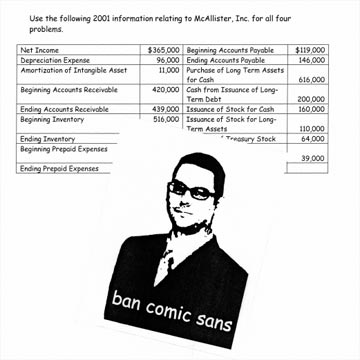
I couldn't have said it better myself. They even have a photo gallery documenting instance of Comic Sans misuse, sent in by advocates of the movement. Here is a great example of someone carelessly using Comic Sans on a document that necessitates something more appropriate for its purpose:
I encourage anyone reading this who shares the sentiment to express it in the comments section.
I found another incredible website produced by the Planning Department for the City of Vancouver, showing the revitalization of the False Creek area between 1978 and now. Although it will probably be more impressive to those who have familiarity with the area, it will still be pretty incredible for those who do not.
...
HAPPY BIRTHDAY, LENNY!
Love,
Krista


4 comments:
THANK YOU!!! Agreed - I freaked out once at a TV program that used the evil font it it's credits. Gah!
Heh, just to make everyone angry:
right in the middle of the page
Finally: Billy-Ann, how could you!
Thanks Krista, it's nice to know I'm not the only one. I'm always irritated when students use inappropriate fonts like Comic Sans MS on term papers, etc. (this is second only to students e-mailing me in txt msg spk in my pet peeves about teaching) but I thought I was being freakish and weird. At least there are others out there who appreciate the value of a good font.
Hey, maybe I could use it on some wedding invitations...
Post a Comment